Nana
10/04/23
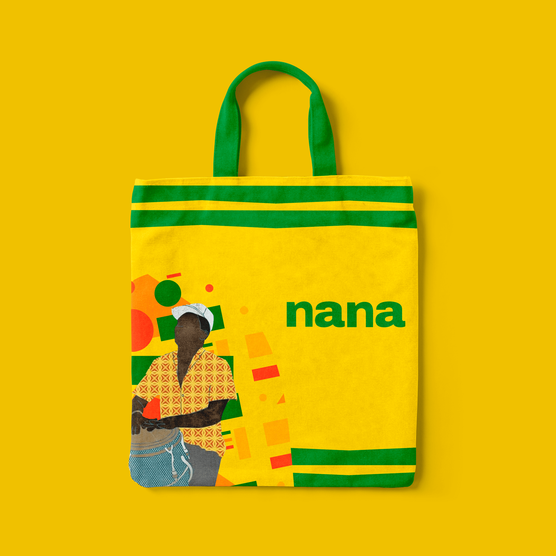
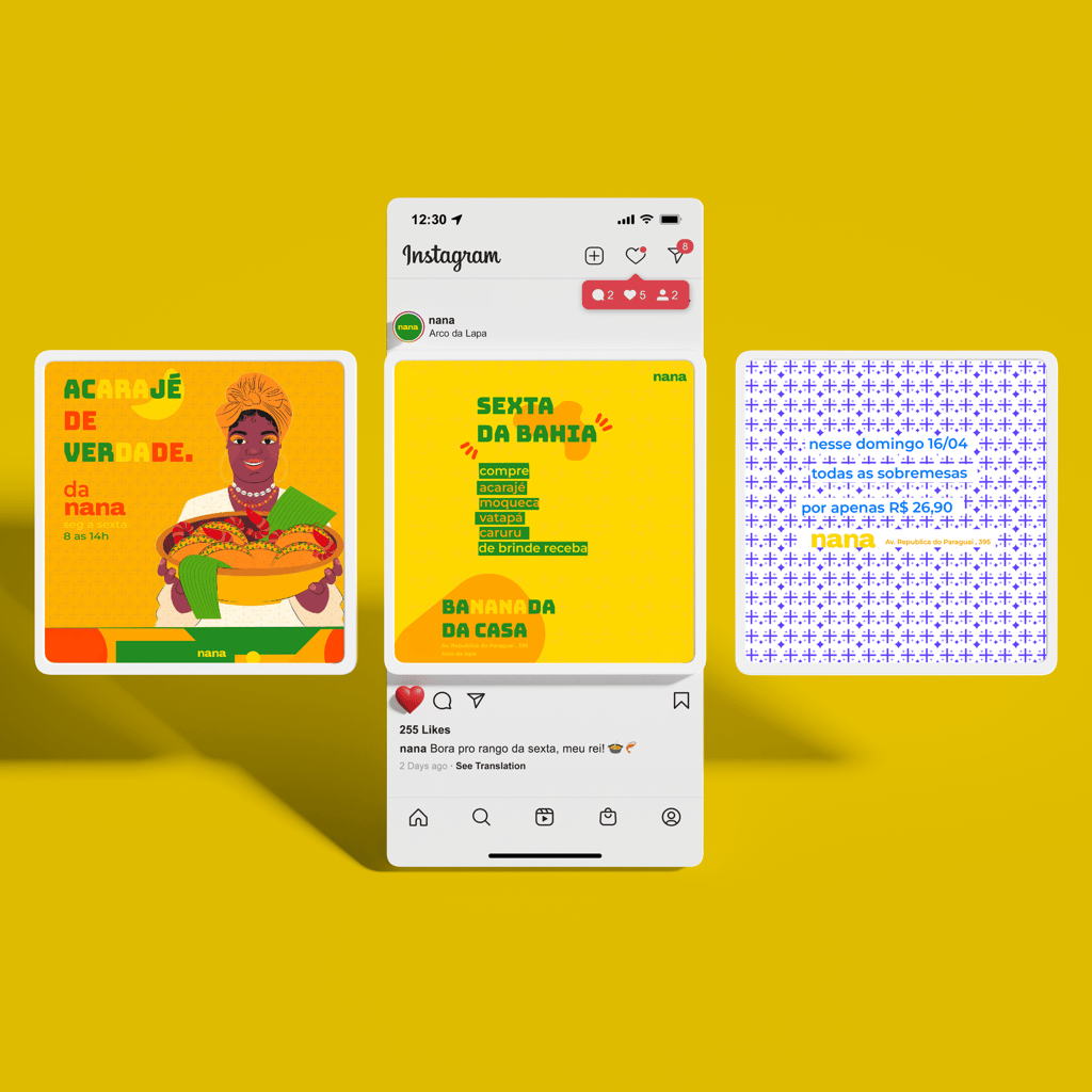
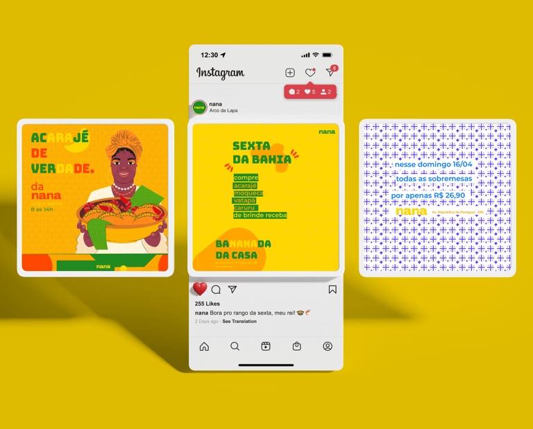
Nana's visual identity is an authentic representation of the rich Bahian culture, located in Lapa, Rio de Janeiro. With vibrant colors and striking typography, the visual identity was carefully created to capture the essence of Bahia's cuisine and traditions.
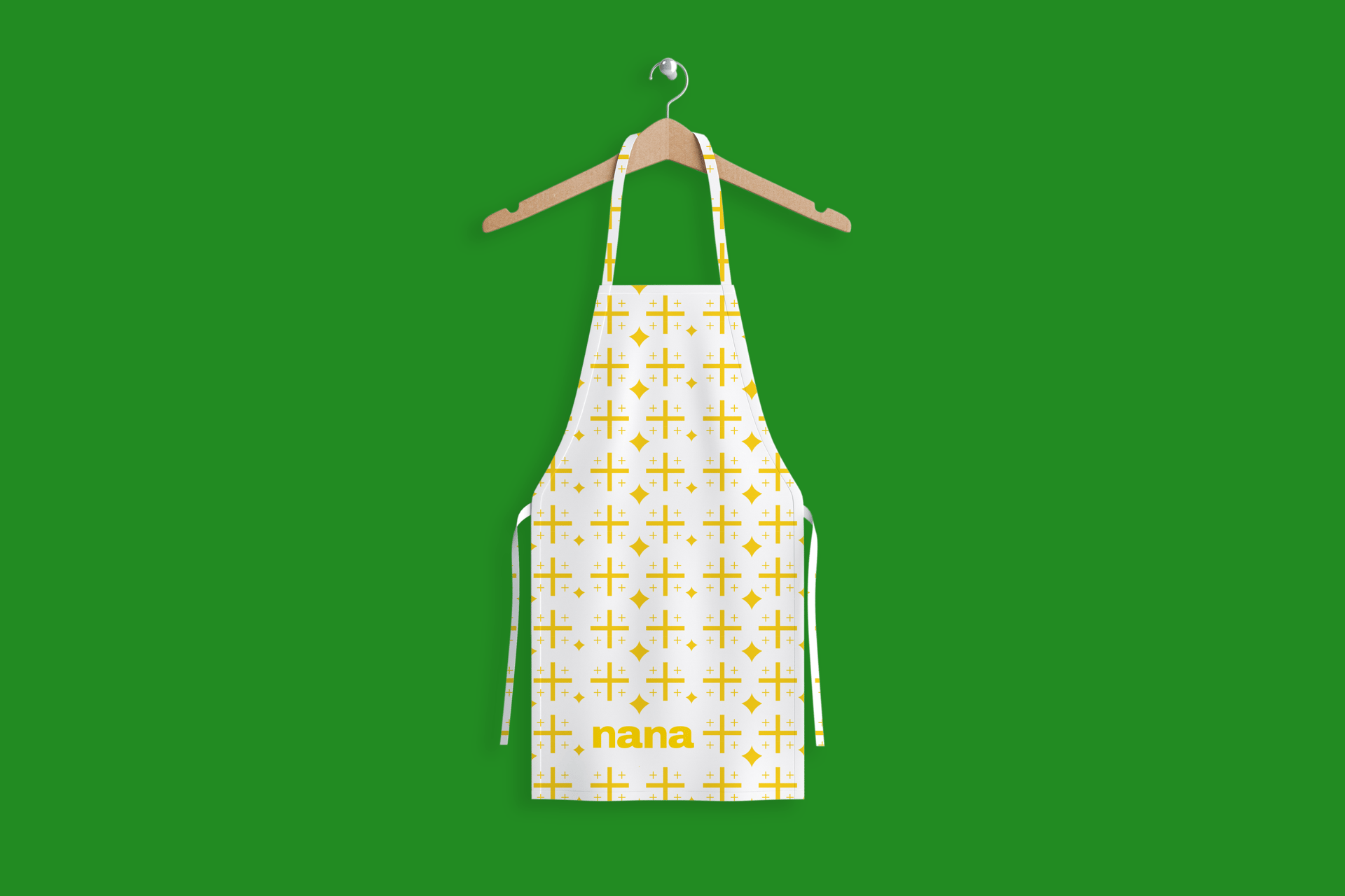
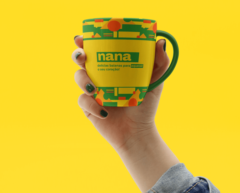
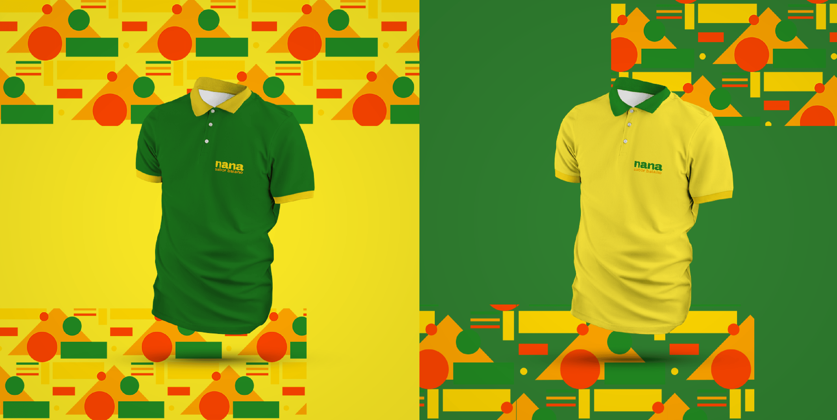
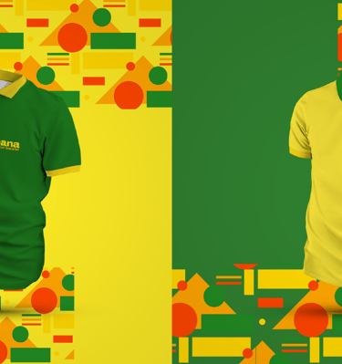
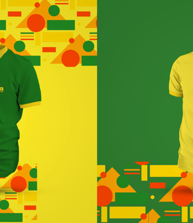
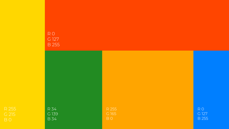
The colors used in Nana's color palette are green, yellow, blue, red and orange. Green represents the exuberant nature of Bahia, yellow symbolizes the energy and joy of the people of Bahia, blue refers to the sea that bathes its beaches, red represents the passion and intensity of local culture, and orange evokes the richness of spices. present in Bahian cuisine.
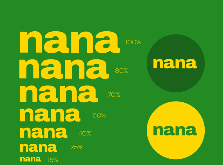
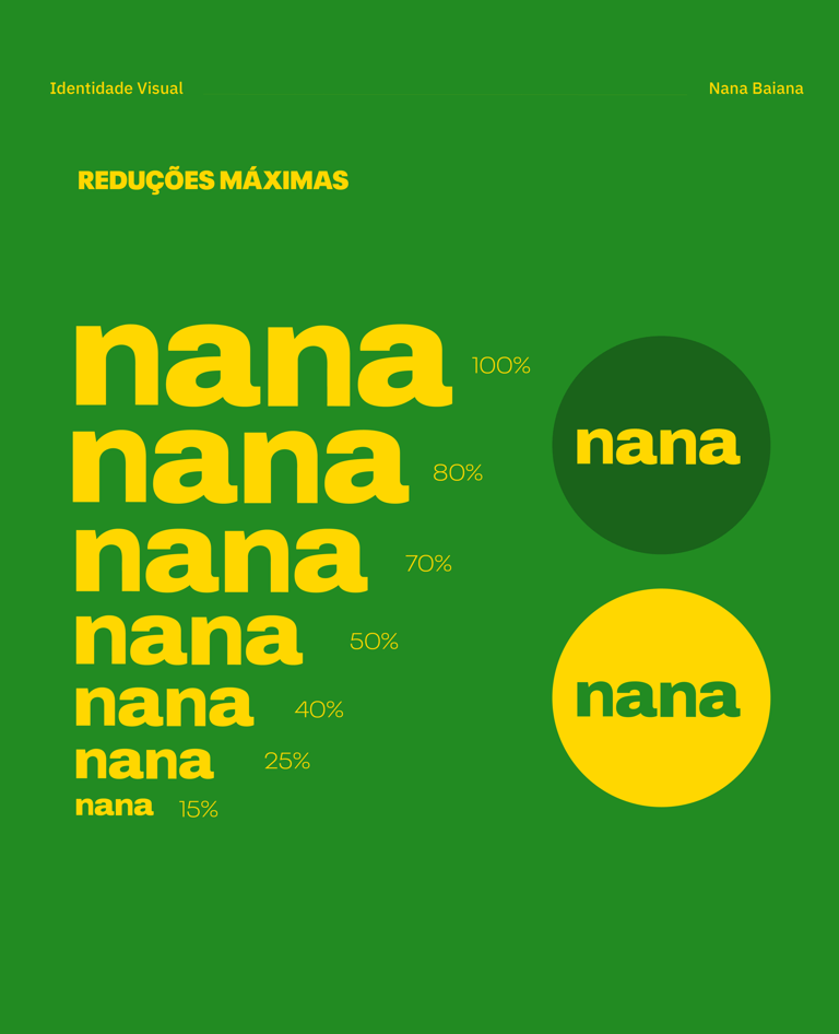
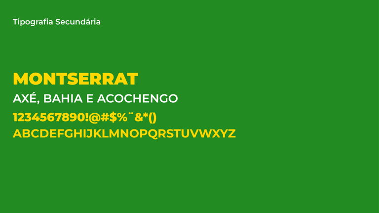
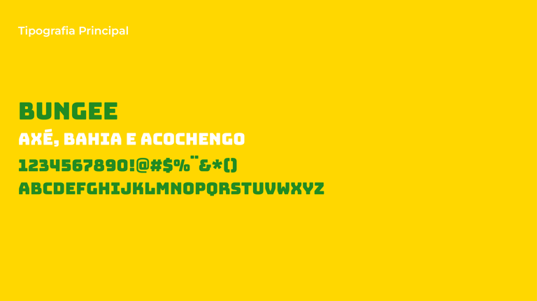
The main typography used is Bungee, which is a modern and bold font, with geometric shapes that reflect the contemporary and originality of the restaurant. The secondary typography is Montserrat, a classic and elegant font, which adds balance and legibility to the visual identity.
The symbols created are abstract geometric shapes and a star that refers to churches. The abstract geometric shapes represent the diversity and creativity of Bahian culture, while the star is a reference to the architectural elements present in many churches in the region, which are important landmarks in Bahia's culture and history.
Nana's visual identity is a unique combination of colors, typography and symbols that capture the essence of Bahian culture and convey the restaurant's authenticity and originality. It was created with care and attention to detail, making it a striking and memorable visual representation of the brand.
service
Design de Identidade
Branding
client
Nana


More projects
Baco

Design de Identidade, Branding
Elizier Personal
Design de Identidade, Branding
Universidade Federal Santa Catarina
Redesign, Branding